


Front + Back invitation card printed in a soft touch finish.
Clarified + modern. Classic + fresh. Design leans into a sophisticated 1920s bend while incorporating textures from the original invitation to connect the two events together in a subtle way.


Food labels echo the invitation in a more subdued way, keeping the textual components and letting the interest of the type shine.


For the second wedding celebration, (Post-covid), clients designed their own beverage recipes and wanted creative menu cards for guests to reference.
Taking a more geometric approach, these menu cards provide visual interest incorporating line and texture for a punchy vibe.
Cookie designs for the event. A simplification of the invitation; letting typeface shine again here.
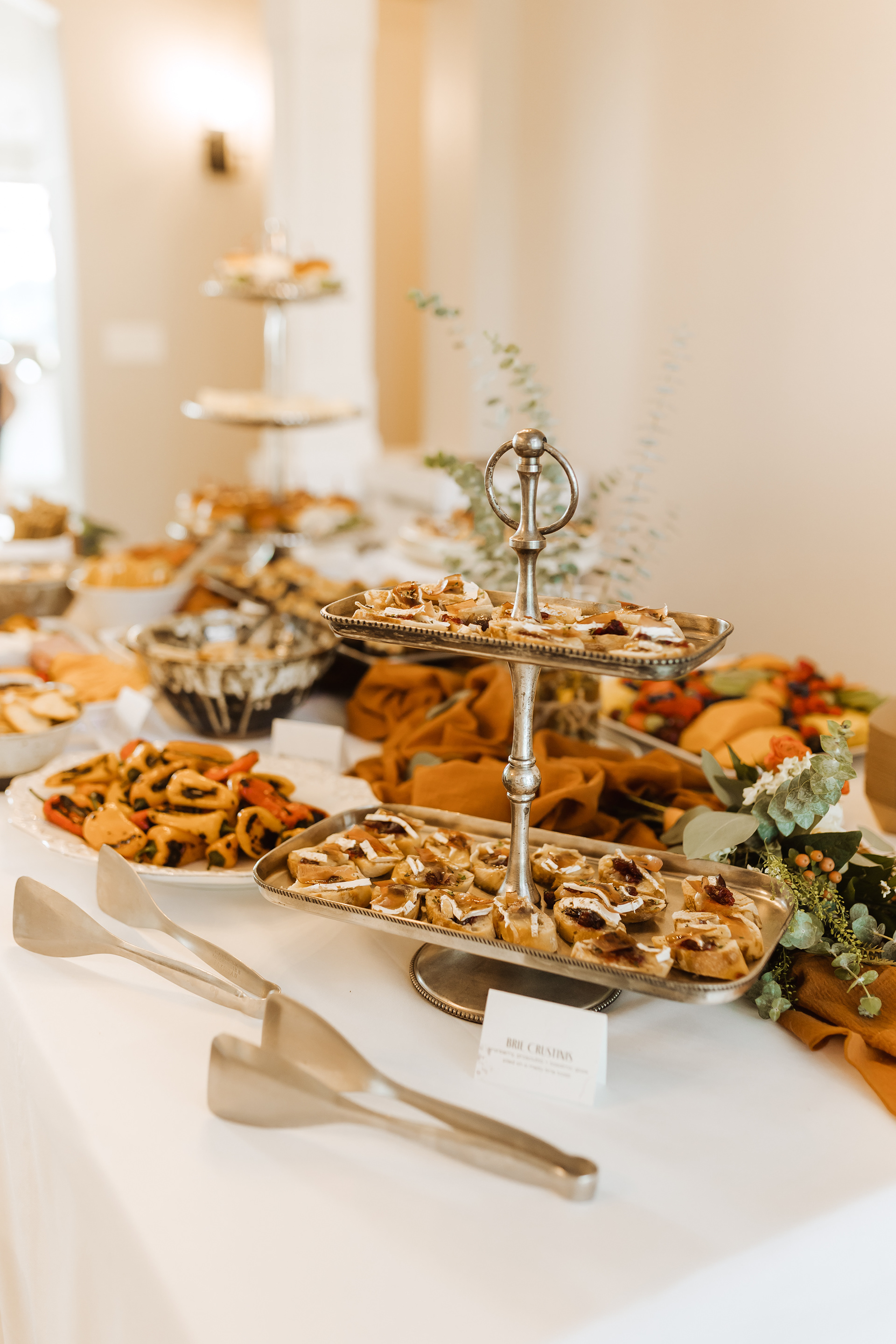


Images above taken by @Emilymariepaulson photography.